|
Twin Peaks (1989) employed a title sequence unlike anything produced for an on-going, broadcast television program before it. The theatrical feature length title sequences designed by Wayne Fitzgerald for the premiere episodes of Battlestar Galactica and Buck Rogers, while longer than the titles in other television programs, were also special title sequences that were not used again during the course of the program�s run; instead shorter, more typical titles for television programs replaced them for the remaining episodes in the series; this was not the case with Twin Peaks. Running almost three minutes, organized around a tonal montage contrasting nature with industrial machinery, it did not show any scenes or characters drawn from the program itself: these titles would be more appropriate for a commercial feature-length film than a television program.
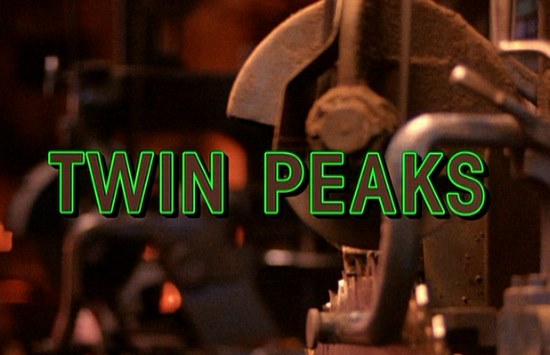
There are a number of significant differences between David Lynch�s TV show and earlier broadcast programming, ranging from how it was shot, (as a theatrical feature film would be, both on the level of camera work and lighting to the framing and editing of sequences), to the use of actors better known for working in commercial feature films. The title sequence for Twin Peaks is representative of the ways the entire program challenged the standards for the design and production of television programs generally; it comes at the moment when the Broadcast/Network TV paradigm was in transition to the Cable TV paradigm that would dominate the 1990s.
The titles for Twin Peaks violate the standard conventions for a police/detective program. These programs have been a continuous part of television programming since its beginnings. The organization of the title sequence has been an essential indicator of specific sub-varieties of detective program: the distinction between an action-based detective show and one that follows the investigation process, whether a private detective or the police, is reflected in the style of the show opener, even though there are definite points of contact and overlap between the more action-based and investigation-based variants: it is typically a collection of images drawn from the show's episodes, revealing the lead detective going about an investigation, often in a pixellated or slow-motion action sequence; Twin Peaks has nothing like this in it.
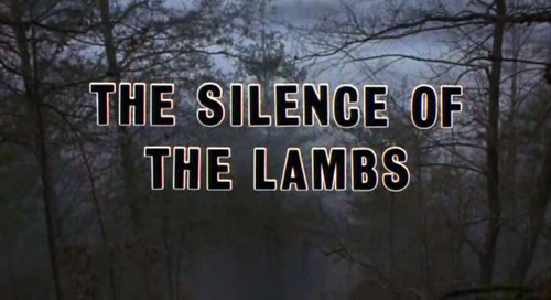
Perhaps coincidentally, the titles Milton Glaser designed for The Silence of the Lambs (1991) closely resemble the design of Twin Peaks' title sequence.
|