|
William Golden, (1911 � 1959), Creative Director of Advertising and Sales Promotion at CBS television was responsible for a Modernist revolution that defined broadcast design and titles during the live era of television as a 'modern' and 'prestige' production. 
CBS used modern design as a vehicle to brand themselves as �the Tiffany network��the source for more prestigious programming�a strategy that melded the business concerns of television executives with the design strategies of modernism. This decision was also an issue of competitiveness, as Gilbert Seldes, (1893 � 1970) head of the television department at CBS starting in 1937, and one of the first critics to engage with American experimental film, explained in MoMA�s 1962 exhibition Television U.S.A.: 13 Seasons that
The natural connection with radio�that TV transmits sound as well as images�was reinforced by the industrial connection: the greatest investment in laboratories where the new apparatus was being developed was made by RCA, parent of the National Broadcasting Company [NBC]. Westinghouse and Philco, both interested in radio, were also carrying on experiments. A non-manufacturing network , like CBS, was compelled to buy equipment from its corporate rivals.
[Gilbert Seldes, �Past and Present� in Television U.S.A.: 13 Seasons (New York: The Museum of Modern Art) p. 7.]
Because CBS was forced to buy its broadcast equipment from competing television networks who would have access to improve technology at the experimental stages of its development, it was forced to develop an alternative strategy to attract customers�one based on the content of their programs, rather than the purely technical issues of picture and sound quality. Their need to distinguish themselves from the three other television networks�NBC, ABC and DuMont�created a need for innovative solutions that was met through the adoption of Modernist design and the organization of an internal design and marketing department within the network.
With the separation of radio and television broadcasting into two different companies at CBS, the need to differentiate these companies became the first design problem for William Golden�s new department of Advertizing and Sales Promotion, formed in 1951. The most important of the designs Golden produced became the iconic logo for CBS. His designers used it for both on-air and in-print promotion of the new television broadcaster:
The function of the symbol was not only to differentiate us from the other television networks, but from our own radio network as well. It was first designed when CBS established the Radio and Television Networks as two separate divisions. The two networks were urged to do everything possible to create their own identities.
[Cipe Pineles Golden, Kurt Weihs and Robert Strunsky, editors, The Craft of William Golden (New York: George Braziller, 1962) p. 155.]
Golden�s design served to emphasize the difference between CBS radio and CBS TV, but it, along with the innovative Modernist print design used to advertize and promote CBS programming, also worked to immediately differentiate the CBS programs from those on their rivals NBC, ABC and DuMont. The technical limitations of early television meant that the differences between programs on the networks was actually quite small�a police drama, game show, or comedy on one network would not be noticeably different from those produced on another. Distinguishing between different networks was a matter of style and design more than actual content or programming. The homogeny of 1950s programs is especially pronounced during the earliest years of live production.
William Golden became Creative Director of Advertizing and Sales Promotion in 1951, making him more than just the designer and art director responsible for CBS� print and on-air designs�his role at the network was unprecedented in broadcasting. Golden was put in charge of setting up an in-house design and production office for all CBS advertizing; prior to this moment, outside ad agencies were hired to create promotional materials, resulting in wide variations the style of the network. Title designs for the shows and the print designs promoting those shows were standardized by Golden�s department, enabling a highly uniform engagement and presentation of their networks� content. Thus while the titles on screen might be relatively inanimate, their design would follow the same standard and use the same graphics as the newspaper ads for that show, linking the various presentations through a consistent �look.� It is a model that Hollywood films would embrace�under the influence of Saul Bass� work�by the middle of the decade.
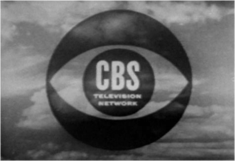
Golden developed the entire corporate image for CBS, including its iconic eye logo launched in October 1951; the department he created was organized as a �craft shop��following the organizational model of the arts and crafts movement:
Once he stops confusing Art with design for Business and stops making demands on the business world that it has neither the capacity nor obligation to fulfill, [the designer will] probably be all right. In fact I think he is pretty lucky. In the brave new world of Strontium-90�a world in which craftsmanship is an intolerable deterrent to mass production�it is a good thing to be able to practice a useful craft.
[William Golden. The Visual Craft of William Golden, (New York: George Braziller, 1962) p. 63.]
Golden�s view that design was not art, but a specific variety of craft, is apparent in the organization of a small department of thirty-nine employees that embraced innovation and functioned autonomously within the corporate structure of CBS. This organization depends simultaneously on a view that Art and craft are distinct fields, but at the same time borrows innovations and approaches from the art world as techniques for improving the designs produced by his department; while he claims the designer and artist are entirely different, his department behaved with the autonomy and independence commonly associated with artists. The separation of Golden�s department from the other �masters� at CBS was essential to its success. He explained the quality and consistency of his designs at CBS as resulting from the separation of his department from the rest of the corporate structure:
[Their designs] were for the most part kept clean and powerful because they were made by a consistent policy, by one department with the approval of one agency of management. They were never shown to anyone in advance of publication.
[Lynn Spigel, TV by Design: Modern Art and the Rise of Network Television, (Chicago: University of Chicago Press, 2008) p. 83.]
This independence enabled Golden to oversee all dimensions of the design and production process, including the selection of paper stocks, typefaces, packaging and shipping of their promotional materials to ensure a high level of design quality that even extended to the ink color used to meter the postage.
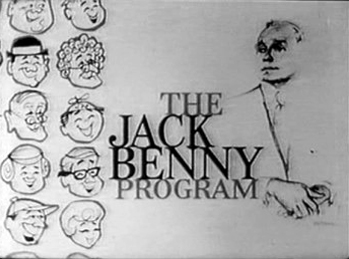
Immediately upon starting his department in 1951, Golden hired well-known illustrators to draw the visuals used to promote CBS programs. French illustrator known for his fashion illustrations in Vogue, R. R. (Ren� Robert) Bouch�, created a series of portraits showing the network�s stars. These blotted-line images that balanced smudgy details with empty white space were used in print and on-air as part of the titles for each of these live programs. The series began with newscaster Edward R. Morrow and included comedians Jack Benny, Red Skelton, George Burns and Gracie Allen, as well as actors Bing Crosby, Eve Arden and Raymond Burr. All these illustrations included Bouch�s signature and gave the impression of being artworks not simply advertisements�this transformation from ad to prestige artwork was crucial to CBS� identity as the �Tiffany Network� in the 1950s. Golden�s rationale for this decision reveals how Modernist design served the goal of distinguishing CBS from other television networks:
Faced with the new fact of consumer advertizing, we tried to consider it carefully. . . . We tried to consider it as a new entity. We didn�t think we should imitate the advertising of motion pictures or the theater, because it was neither of these things. We knew very well that theatrical advertizing was burdened with its own baggage and its obsolete traditions. We considered it an opportunity to make a new kind of advertizing for a new medium.
[William Golden, unpublished report, �The Background of Consumer Advertizing� (c. 1957), quoted in Lynn Spigel, TV by Design, p. 89.]
The rejection of motion pictures as being a different medium and the relegation of theatre as coming from an �obsolete tradition� is distinctly Modernist: it is an insistence on the medium-specificity of television as a distinct form, independent of other media and past traditions. At the same time, it was a distinction of especially great importance given that TV and live theater otherwise were very similar in production capacities and were technically limited in similar ways to what could feasible be done in front of an audience. This division of television from other, obviously related fields is a common feature to all Modernist artists, and its appearance in Golden�s justification reveals the close connections between design and art during this period. The use of what had been avant-garde aesthetics twenty years earlier had become the �mainstream� understanding of the 1950s.
Golden�s transformation of CBS was enabled by the interest in Modern art of both the chairman William S. Paley, and president Dr. Frank Stanton, who had a doctorate in the psychology of audience retention of media messages. Stanton explains the decision to embrace Modern design as a marketing tactic to distinguish CBS from other networks:
Everything we produce at the Columbia Broadcasting System, including our own printed advertizing, reports, documents, and promotion is carefully considered from the viewpoint of the image we have of ourselves as a vigorous, public-spirited, profitable, modern enterprise. We give the most careful attention to all aspects of design. We believe that we should not only be progressive, but look progressive.
[Frank Stanton, introduction in The Visual Craft of William Golden, (New York: George Braziller, 1962) p. 9.]
The audience that mattered the most to the network were the advertisers: creating the impression that CBS was the premiere network translated into the ability to charge more for advertizing on air. This Modernist transformation began immediately in 1951. Golden�s designs for CBS succeeded in promoting it as the �prestige� network, making it the top network throughout the 1950s and into the 1960s. His department produced material for two distinct audiences: directly to prospective advertisers, and to the general public through designs for on-air and in print. These designs, distributed to the affiliate stations nationwide, gave a more uniform style and appearance to CBS, even though there were local differences outside New York since the individual affiliates would produce some of their own print designs using materials provided by Golden�s department.
This embrace of Modernist design in a highly commercial medium where business concerns determined the aesthetic forms chosen is symptomatic of the transfers between the art world and commercial world that surrounded television production in the 1950s; by the 1960s this engagement would be primarily limited to advertising, but prior to 1955, the overlap extended to the content of television productions as well. The rise of television commercials�a shift from the early, live shows that had a single sponsor who was more important than the actual program shown to multiple sponsors who buy �time� during the commercial breaks�was due to this change in production method: entire shows could be paid for and filmed by the studios without the need for an outside partner, thus enabling the shift from sponsored shows to commercial programming that has dominated TV ever since.
|

|