from Cinegraphic.net:
Traditional Conceptions of Title Sequences
story © Michael Betancourt, July 1, 2016 all rights reserved.
URL: https://www.cinegraphic.net/article.php?story=20160629101934320
The title sequence has been a common element in the presentation of motion pictures throughout their history in the United States. The organization of title sequences has varied greatly in complexity, duration and distinguishability from the central drama over the more than 125 years of motion picture production in the United States; the earliest examples were produced by Edison's Black Maria studio in the 1890s. These title sequences were minimal, a simple title card that served as a unique identifier for purposes of copyright registry; however, with the shift to dramatic, feature length narratives the need for text on screen became increasingly necessary to present dialogue and other narrative information.
The importance of these title cards--both for the main title and dispersed throughout the film as intertitles--gave their designer/writers a prominence during the so-called "silent era" before the dominance of synchronous sound productions they will lose once sync sound production begins after 1927. These designers’ who received on screen credit for their work differed dramatically from the Modernist style introduced by Saul Bass in the 1950s--their work was highly limited technologically compared to those later titles which used an optical printer to combine live action and graphics. Unlike the titles/credits from the beginning of the "talkies" in the later 1920s and 1930s, these "silent" titles were an integral part of the narrative itself, providing not only the absent dialogue, but presenting editorial commentary and exposition. These earlier designs were most commonly produced as static title cards, and the distinction between expository and other credits in one of the films produced without a synchronized soundtrack was often oblique, if apparent at all.
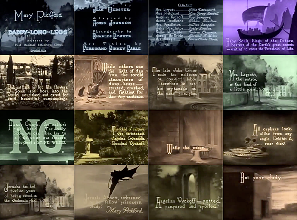
For example, Ferdinand Penney Earle's "Art Title Design" for Daddy Long Legs (1919) starring Mary Pickford is an exemplar of the approach common in this early period that renders these title cards’ aesthetic organization of text and image comparable to what appears in a picture book or illustrated magazine of the 1910s or '20s. His combinations of typography and painting appear throughout the film, providing narrative exposition. Individual title cards are toned various hues--blue, sepia, magenta or green--a design choice that reflects the emotional tenor of the typography on that title card. The title cards from the opening credits and initial explosion show how these hues act to group different series of titles: blue for the three opening credit title cards, then magenta for the start of the exposition. Once sound production begins, these decorative arrangements of text and image will be confined to the opening credits, and the designer's role in their production will rapidly fade. The transition from "silent" to "talkie" production is apparent in the disappearance of the identified title designer from the opening credit sequence. Jack Jarmuth receives on-screen credit for his work in 1927's The Jazz Singer, but by 1934 such credits will disappear.
The return to giving on screen credit to title designers, starting with Saul Bass in 1954 (for Carmen Jones), happened in context with graphic designers such as Alvin Lustig and Paul Rand actually including their signature as an essential feature of their designs. Like the signature in graphic design, receiving on-screen credit as a "title designer" is a feature of how the important, serious Modern title designers such as Saul Bass, Maurice Binder, Robert Brownjohn or Pablo Ferro identified and distinguished their work as different from the (often uncredited) work of designers working in the studios, or at independent 'optical' companies such as The Pacific Art and Title Company, better known as "Pacific Title."
This mid-century shift from uncredited, anonymous production work, to credited, high profile marker for both seriousness of aesthetic intent and signifier of prestige production came as a sudden transformation--even though it was prepared for by more than a decade's worth of graphic designers in the United States boldly signing their designs (and even incorporating their signatures into those designs as an essential element). Title designers commonly describe sequences precisely as a transition signaling movement into the diegetic space of the film: they function as an invocation of a “magic circle” for storytelling. This theorizing of the title sequence is often credited to the graphic designer Saul Bass whose title sequence for The Man With The Golden Arm (1955) is often identified as a turning point in the production of title sequences in Hollywood films. Bass has discussed this role for title sequences in an interview shortly before his death in 1996 with historian Pamela Haskin:
My initial thoughts about what a title could do was to set the mood and to prime the underlying core of the film's story; to express the story in some metaphorical way. I saw the title as a way of conditioning the audience, to that when the film actually began, viewers would already have an emotional resonance with it.[Haskin, P. "Saul, can you make me a title?" in Film Quarterly, Vol. 50 no. 1, Autumn 1996 pp 12-13.]
Bass' description of titles as an introduction to the narrative space is typical of designer’s conception of title sequences. Because they are commonly situated at the very beginning of their respective films, theorizing them as a transition between the reality 'outside' the narrative and the fictional world 'inside.' The audience’s awareness of simultaneously that the actors are posing as someone other than who they are organizes the entire process of the film, not simply those of the titles, but the fiction itself. Title sequences are wholly subservient to the production that follows: because the titles occupy the space between the actions of the fictional story (the diegesis) and the reality that lies outside that artificial (imaginary) space, however much the rest of the film might resemble a documentary presentation of 'reality,' a title sequence stands as a "gateway" between these mutually present, contradictory relationships.
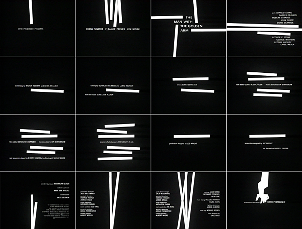
Saul Bass' role in promoting this conception of the opening title sequence is self-serving: it serves as a justification for his receiving on-screen credit within the sequence itself, (and supports the high rates he charged to design and produce these sequences). This view of the title sequence as a synecdotal encapsulation of the narrative itself, whether in graphic form (as in Bass' 1955 design for The Man With the Golden Arm) or through the symbolic evocations of montage is commonly linked to their conception and interpretation, as Georg Stanitzek explains in his article "Reading the Title Sequence," the film is begun paradoxically with and after the title sequence:
Title sequences create a divided focus of attention, the separation of the inside from the outside, of what is the play of the narrative from what is documenting the production, cinematic narrative from film commentary, intradiegetic from extradiegetic information. The title sequence achieves this as a film within a film, in that it introduces, in that it--semi-autonomously--establishes itself as distinct from the main film. [...] It is in this sense that the title sequence constitutes the beginning of the film, which, at the same time, it represents. As the beginning, the title sequence sets itself apart in a particular way; namely, insofar as it is endowed with its own beginning and end, it establishes itself as distinct and develops its own coherence. In turn, its own beginning might possibly be seen as set apart; as a rule, the title sequence starts with the studio’s or the distributor’s trademark logo, which itself acts as a kind of title to the title sequence proper as the title sequence does to the movie proper.[Stanitzek, Georg. (2009). "Reading the Title Sequence (Vorspann, Génčrique)." Cinema Journal Vol. 48 no. 4, 44-46.]
For such an introductory role/purpose, almost any design might work equally well so long as it sufficiently serves to prepare the audience for the story that follows. To designate the transition between everyday life and the cinematic experience as the role of the title sequence inherently recreates a specific set of inherited conventions from earlier forms of theater; it plays the role of the theatrical curtain, parting as the program begins, and closing once the performance has concluded. Any particularly notable features in any title sequence are thus simply the flourishes that might be expected of a well designed textile: decorative, interesting, belonging to a tradition of earlier designs, but of only limited significance in themselves: critical considerations and analysis of these designs thus become exercises in stylistic affirmation: clarifying traditions, identifying the precedents, elaborating upon the embellishments provided by the titles--all that can be expected of what is essentially a minor art. Yet what is of interest about this often neglected form is precisely the ways that it has an ambiguous relationship to the motion picture that follows: what role does the title sequence have for this, the main focus of so much theory, criticism and historical analysis? For much of the history of motion pictures made in Hollywood, the designers responsible for the titles went uncredited, their skills and work passing in front of the audience often without comment or consideration by the reviewers--and yet this opening moment (so often invisible to criticism and analysis) is the actual beginning of the motion picture itself.
As Stanitzek notes, title sequences are produced in a secondary relation to the main part of the motion picture; however, they are also created independently of that production, employing an entirely different crew and using procedures more commonly used in sign painting and animated cartoons; however, this division of labor into discrete tasks performed by specialists has been a feature of the Hollywood studio system since its inception: the director, the cinematographer, the screenwriter are seldom the same person. The musical score composed for the film or television show bears many of the same constraints and distance from the rest of the production that the titles do. Yet the title sequence has been singularly distanced from the rest of the production process.
This distancing of the title sequence--as subservient and at the same time independent of the rest of the motion picture--suggests a paradoxical role for these beginnings (and sometimes endings) for movies. To be subservient implies the subordination of the constructive and aesthetic form of the titles to the design and structure of the main 'body' of narration and production that follows. While the title sequence’s content--the names and other credits that appear--are deeply dependent on the specifics of the film production to which a particular title sequence is attached, at the same time, the form of these titles may not resemble the film that follows in any fashion at all, aside from what can be heard, (the music composed as the theme). The visual form can be entirely independent of what appears inside the actual production.
Copyright © Michael Betancourt July 1, 2016 all rights reserved.
All images, copyrights, and trademarks are owned by their respective owners: any presence here is for purposes of commentary only.